Emma Peterson

Home
About
Contact
See the final interactive prototype of my JOINLU website redesign here.
In initial user testing, I discovered that the primary problem facing users interacting with JOINLU’s website what a lack of understanding of the company: what they do, what services they provide, and how to get in contact with the company.
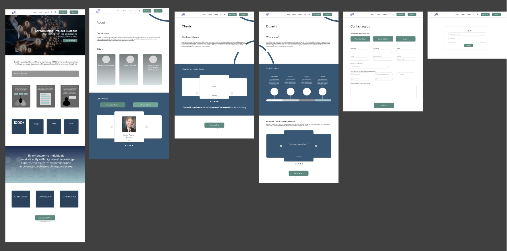
The redesign of the JOINLU website was structured to mitigate three issues: 1) to supply visual components with more purpose and clarity, 2) to emphasize the key aspects of JOINLU's business, and 3) to create a site that facilitates the target users ability to find the right services for their needs. In our project, we documented the occurrences of these issues through methods of user research and client communication.
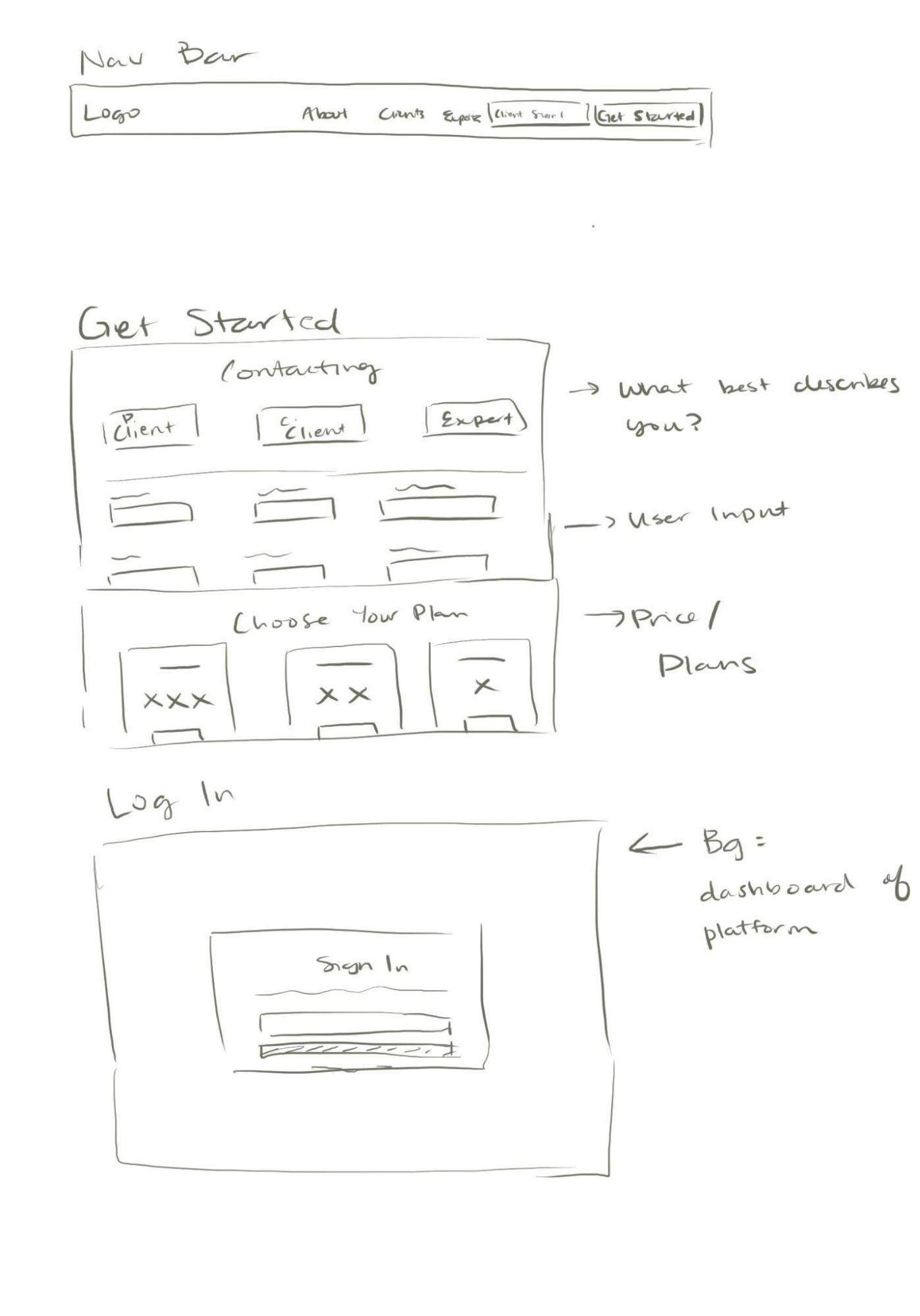
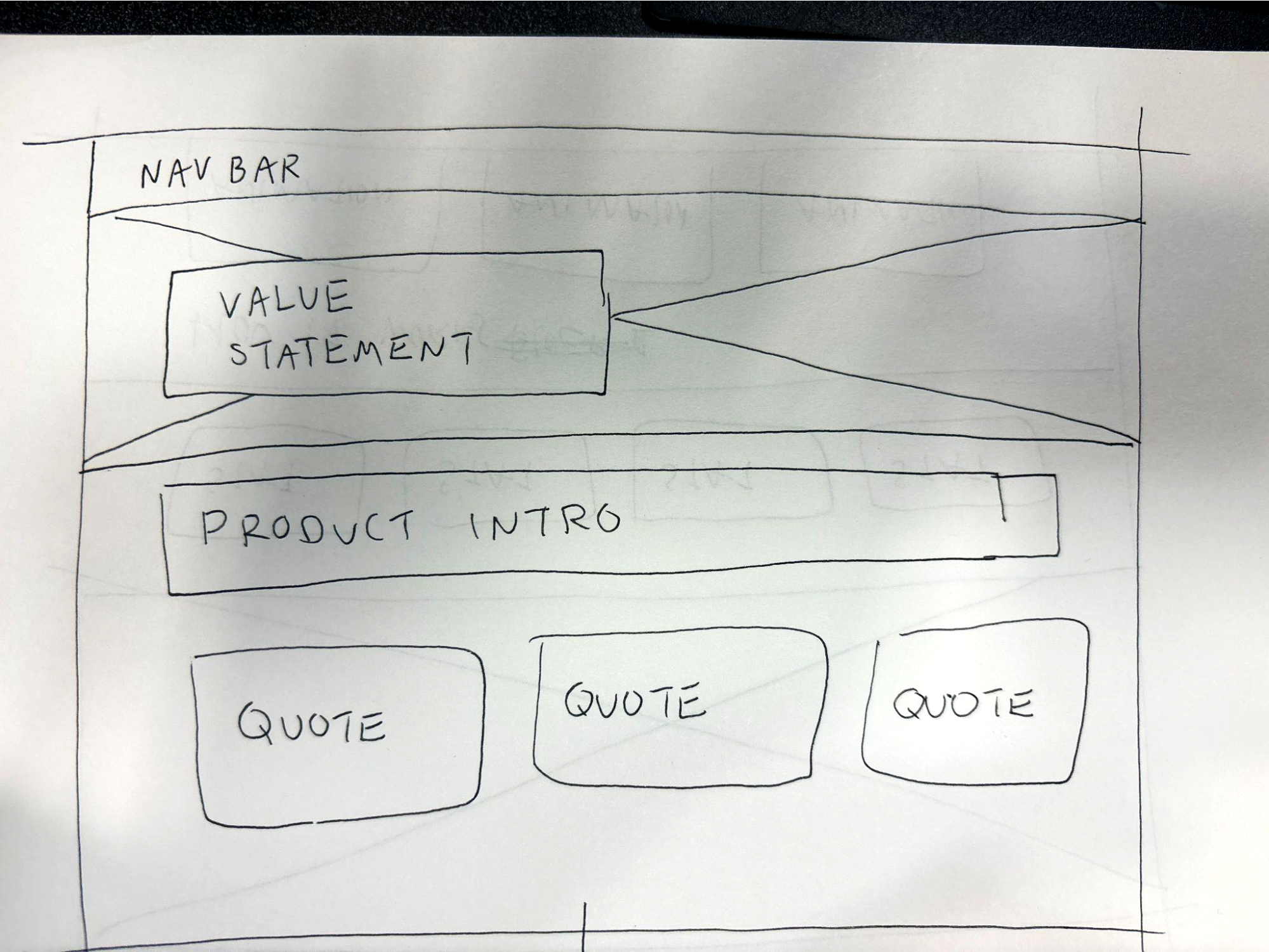
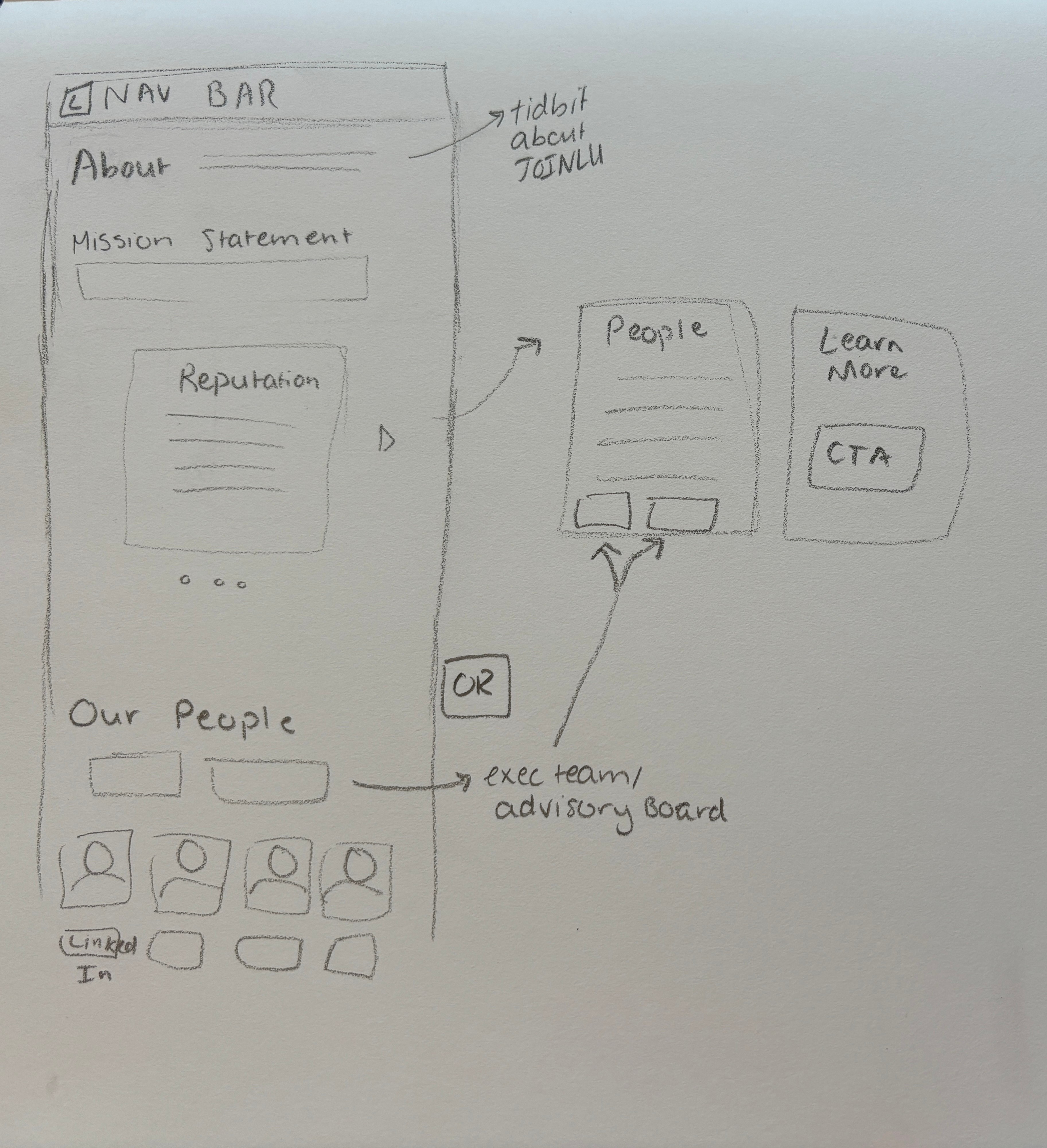
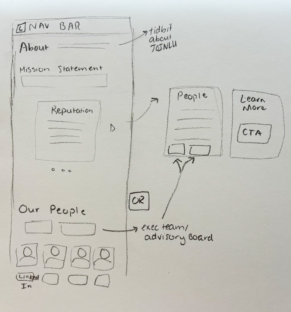
Sketches
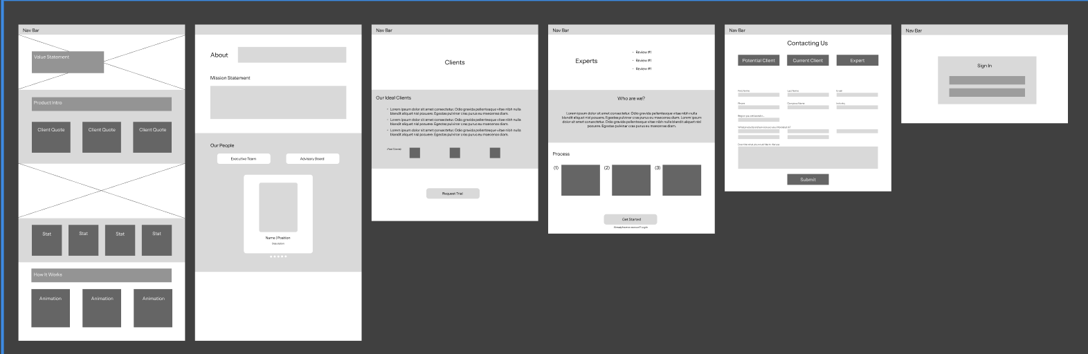
Low Fidelity Prototype
In converting my sketches to digital lo-fi prototypes, the biggest takeaway was able realizing that I needed a lot more negative space than I had included in the sketches.
Process
Overall, we wanted our redesign to reflect our users’ unanimous desire for a simple and straightforward site with the information they need about the company readily available with as few clicks as possible.
Methodology
Impact
Results
Our user testing process to gauge the impact of our changes from the original JOINLU website consisted of informal sessions to gather information from 12 users, gathering data on the participants’ actions taken once on certain page and impressions of the site once they have completed all interactions. Users were asked to peruse the prototype and comment aloud their thought process while navigating the site.
- Tested if users interacted with new CTAs on the home page (“learn more”, “get started now”)
- Tested which navigation bar components were most frequently used
- Tested how frequently users navigated to footer informational components
- Tested if users interacted with new CTAs throughout site (“contact us”, “request trial”)
- Tested if users utilized new search function
- 100% (12/12) users attempted to utilize new search function (test of initial site: no search function)
- 75% (9/12) users utilized new CTAs on home page (test of initial site: no CTAs)
- 75% (9/12) users were able to identify which page held the information appropriate for their role (previous client, current client, expert) (test of initial site: 0/12)
- 58% (7/12) of users attempted to contact JOINLU through the clients tab (initial test of site: 0/12)
- 50% (6/12) of users felt about page/mission statement were comprehensive and answered their questions about purpose of company (test of initial site: 0/12)
See the final interactive prototype of my JOINLU website redesign here.
In initial user testing, I discovered that the primary problem facing users interacting with JOINLU’s website what a lack of understanding of the company: what they do, what services they provide, and how to get in contact with the company.
The redesign of the JOINLU website was structured to mitigate three issues: 1) to supply visual components with more purpose and clarity, 2) to emphasize the key aspects of JOINLU's business, and 3) to create a site that facilitates the target users ability to find the right services for their needs. In our project, we documented the occurrences of these issues through methods of user research and client communication.
Process
Sketches
Low Fidelity Prototype
In converting my sketches to digital lo-fi prototypes, the biggest takeaway was able realizing that I needed a lot more negative space than I had included in the sketches.
Emma Peterson
Home
About
Contact
Overall, we wanted our redesign to reflect our users’ unanimous desire for a simple and straightforward site with the information they need about the company readily available with as few clicks as possible.
Impact
Methodology
Our user testing process to gauge the impact of our changes from the original JOINLU website consisted of informal sessions to gather information from 12 users, gathering data on the participants’ actions taken once on certain page and impressions of the site once they have completed all interactions. Users were asked to peruse the prototype and comment aloud their thought process while navigating the site.
- Tested if users interacted with new CTAs on the home page (“learn more”, “get started now”)
- Tested which navigation bar components were most frequently used
- Tested how frequently users navigated to footer informational components
- Tested if users interacted with new CTAs throughout site (“contact us”, “request trial”)
- Tested if users utilized new search function
Results
- 100% (12/12) users attempted to utilize new search function (test of initial site: no search function)
- 75% (9/12) users utilized new CTAs on home page (test of initial site: no CTAs)
- 75% (9/12) users were able to identify which page held the information appropriate for their role (previous client, current client, expert) (test of initial site: 0/12)
- 58% (7/12) of users attempted to contact JOINLU through the clients tab (initial test of site: 0/12)
- 50% (6/12) of users felt about page/mission statement were comprehensive and answered their questions about purpose of company (test of initial site: 0/12)
Researched, designed, and prototyped rebranded a new website for Ann Arbor based expert intelligence platform JOINLU.
See the final interactive prototype of my JOINLU website redesign here.
In initial user testing, I discovered that the primary problem facing users interacting with JOINLU’s website what a lack of understanding of the company: what they do, what services they provide, and how to get in contact with the company.
The redesign of the JOINLU website was structured to mitigate three issues: 1) to supply visual components with more purpose and clarity, 2) to emphasize the key aspects of JOINLU's business, and 3) to create a site that facilitates the target users ability to find the right services for their needs. In our project, we documented the occurrences of these issues through methods of user research and client communication.
Process
Sketches
Low Fidelity Prototype
In converting my sketches to digital lo-fi prototypes, the biggest takeaway was able realizing that I needed a lot more negative space than I had included in the sketches.
Emma Peterson
Home
About
Contact
Overall, we wanted our redesign to reflect our users’ unanimous desire for a simple and straightforward site with the information they need about the company readily available with as few clicks as possible.
Impact
Methodology
Our user testing process to gauge the impact of our changes from the original JOINLU website consisted of informal sessions to gather information from 12 users, gathering data on the participants’ actions taken once on certain page and impressions of the site once they have completed all interactions. Users were asked to peruse the prototype and comment aloud their thought process while navigating the site.
- Tested if users interacted with new CTAs on the home page (“learn more”, “get started now”)
- Tested which navigation bar components were most frequently used
- Tested how frequently users navigated to footer informational components
- Tested if users interacted with new CTAs throughout site (“contact us”, “request trial”)
- Tested if users utilized new search function
Results
- 100% (12/12) users attempted to utilize new search function (test of initial site: no search function)
- 75% (9/12) users utilized new CTAs on home page (test of initial site: no CTAs)
- 75% (9/12) users were able to identify which page held the information appropriate for their role (previous client, current client, expert) (test of initial site: 0/12)
- 58% (7/12) of users attempted to contact JOINLU through the clients tab (initial test of site: 0/12)
- 50% (6/12) of users felt about page/mission statement were comprehensive and answered their questions about purpose of company (test of initial site: 0/12)